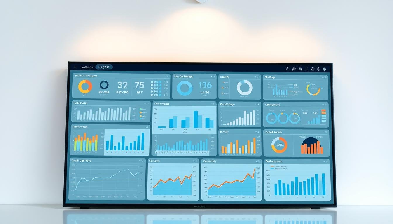
Ever wonder why numbers in spreadsheets become clear when turned into charts? This magic is data visualization. It’s the art of making numbers into pictures that we can understand quickly. From ancient cave paintings to today’s dashboards, pictures help us see complex things easily.
Now, tools like Tableau or Power BI make it even better. They turn spreadsheets into interactive maps and live dashboards. Your Fitbit app is a great example. It shows your steps and helps you set fitness goals. This is how numbers become actions.
Visual stories help us understand data better. Whether it’s sales trends or personal habits, pictures make it clear. It’s not just about pretty pictures. It’s about making insights accessible to everyone.
Table of Contents
Key Takeaways
- Data visualization turns complex information into easy-to-understand graphics
- Techniques range from ancient diagrams to AI-powered dashboards
- Tools like Tableau simplify converting raw numbers into actionable insights
- Exploratory analysis finds patterns; explanatory visuals communicate them
- Modern applications include fitness tracking, business analytics, and more
Understanding What is Data Visualization
Data visualization makes numbers easy to see. It helps us understand things like sales trends or medical studies. This way, we can make smart choices based on the data.
Core Definition and Purpose
Visual Translation of Complex Information
Data visualization is like a special language. It turns numbers into pictures that show us things right away. A well-designed dashboard can show changes in sales quickly, without reading a lot of reports.
This method has two main uses:
- Exploratory analysis: It finds patterns we might miss (like in customer data)
- Explanatory analysis: It shows us what we’ve learned (like how marketing works)
Historical Evolution: From Cave Paintings to Dashboards
Our ancestors drew pictures on cave walls to track their hunts. Florence Nightingale used diagrams to show how to save lives in the 1800s. Today, we use interactive dashboards to keep telling stories with data.
Also Read: Best AI Data Visualization Tools for Stunning Insights
Key Components
Data Sources and Preparation
Good visualizations need clean data. For example, researchers worked hard to make sure a dataset was right before making charts. Steps include:
- Removing duplicate entries
- Fixing measurement errors
- Standardizing date formats
Visual Encoding Techniques
Colors and shapes mean something. Source 3’s study shows:
| Element | Best Use | Example |
|---|---|---|
| Red hues | Highlighting risks | Stock market losses |
| Circular nodes | Showing connections | Social networks |
Narrative Context
A chart about smartphone sales is more interesting with launch dates and prices. Always think: “What story does this data tell?” Adding context makes data useful for making choices.
The importance of data visualization is clear when complex data is easy to understand. It helps in many fields, from health to finance, by making information useful.
Why Data Visualization Matters
In today’s world, turning numbers into useful insights is key. It helps some businesses succeed while others struggle. Visualizing data helps us understand it better and makes business decisions easier.
How Our Brains Process Visual Information
Studies show we see images 60,000 times faster than text. This makes visualizing data very important for making good choices.
Pattern Recognition in Visual Formats
The New York City Bike team cut maintenance costs by 18%. They used maps to find busy bike stations. They found:
- Most bikes are used during rush hours.
- There are bike shortages in tourist spots.
- There’s more bike use on weekends than expected.
Memory Retention Improvements
A study at the University of Pennsylvania found we remember 65% more from pictures than text. This helps teams:
- Remember important numbers during planning.
- Stay on the same page about trends.
- Don’t have to explain data as much.
Transforming Business Operations
Companies using data visualization make decisions 28% faster, says Forrester Research. This change is seen in two main ways:
Decision-Making Acceleration
Marketing teams can now check campaign results quickly. They used to take 72 hours, now it’s just 45 minutes. This lets them:
- Move money around fast.
- Quickly test and improve campaigns.
- Make changes right away.
Cross-Departmental Communication
Visual reports help different teams talk better. A financial firm got 40% more projects approved. They used dashboards to show:
| Metric | Traditional Report | Visual Dashboard |
|---|---|---|
| Understanding Time | 22 minutes | 4 minutes |
| Stakeholder Alignment | 35% | 82% |
| Follow-up Questions | 14 per meeting | 3 per meeting |
This shows how visual tools help teams work together. They turn hard data into something everyone can understand.
Common Types of Data Visualizations
Data visualization is all about different ways to show data. Each type helps solve specific problems. Whether it’s looking at sales or tracking diseases, picking the right way to show data makes it useful.

Basic Charts
Basic charts are great for everyday data needs. They are easy to understand and recognized quickly.
Bar charts for comparisons
Vertical or horizontal bars are perfect for showing differences. They help compare things like sales or product performance. For example, marketers use them to show how different campaigns did.
Line graphs for trends
Line graphs are best for showing changes over time. Financial experts use them to track stocks, and health officials to follow disease spread. They make it easy to see how things change.
Advanced Formats
For complex data, we need more advanced ways to show it. These formats uncover details that simple charts can’t.
Heat maps for density analysis
Heat maps use colors to show where data is most concentrated. Online stores use them to see where people click, and weather experts to show temperature patterns.
Network diagrams for relationships
Network diagrams show how things are connected. They help find unusual patterns in data. For example, they help cybersecurity experts spot odd data flows.
Specialized Displays
Some data needs special displays that show many things at once.
Geospatial mapping
Maps are great for showing data based on location. Health officials used them to track COVID-19, and stores to see how they’re doing in different places.
Interactive dashboards
Today, we use interactive dashboards for business insights. They let you filter data and see different things at once. Tools like Tableau and Power BI make this easy for everyone.
Choosing the right visualization makes complex data easy to understand. For example, a scatter plot of the Iris dataset shows how flowers are similar or different. The right format makes data clear and useful.
Essential Data Visualization Tools
Choosing the right data visualization tools is key. They help you show sales trends or map customer behavior. The tool you pick affects how well you work together and get insights.
Tableau
Tableau is top in big companies for its easy use and strong analytics. Over 70,000 groups use it to make dashboards from big data.
Drag-and-drop functionality
Make charts easily with pre-built templates for many types. Connect to databases fast.
Enterprise-level analytics
The $70/month Creator plan has detailed permissions and predictive modeling tools. Big teams get version control and data rules.
Microsoft Power BI
Power BI is great for Microsoft users. Its $9.99/user/month Pro plan works well with Excel and Teams.
Seamless Office integration
Put Excel spreadsheets into dashboards easily. Share reports via Outlook or show in PowerPoint without changing.
AI-powered insights
The Quick Insights feature finds patterns automatically. You can ask, “Show top-selling products last quarter.”
Google Data Studio
This free tool is best for live marketing data. Agencies and remote teams like its teamwork features.
Cloud-based collaboration
Work on dashboards together with teammates. Feedback and changes are easy to track.
Real-time reporting
Link directly to Google Analytics, Ads, and Search Console. Data updates every hour, no need to refresh spreadsheets.
Python Libraries
Python is top for making custom charts. It needs coding, but Matplotlib is very flexible.
Matplotlib for basic plotting
import matplotlib.pyplot as plt
plt.plot([1, 2, 3, 4], [10, 20, 25, 30])
plt.xlabel('Quarter')
plt.ylabel('Sales')
plt.show()
Seaborn for statistical visuals
Seaborn makes complex charts easy. You can make a heatmap with just five lines of code.
| Tool | Best For | Key Feature | Pricing |
|---|---|---|---|
| Tableau | Large enterprises | Advanced analytics | $70+/month |
| Power BI | Microsoft users | AI insights | $9.99/month |
| Google Studio | Marketing teams | Real-time data | Free |
| Python | Developers | Custom visuals | Open-source |
When to choose: Startups might pick Python or Google Studio for saving money. Big companies go for Tableau/Power BI for support. Apache Superset is a good choice for open-source business intelligence.
Step-by-Step Creation Process
Creating good data visuals needs careful planning and doing. We’ll look at three main steps. These steps go from raw data to nice visuals. We’ll use examples like NY Citi Bike data and Haberman’s Survival dataset.
Data Preparation
First, make sure your data is ready to tell a true story. When using NY Citi Bike data in Python, start by:
Cleaning and Formatting Techniques
- Remove duplicate records with pandas.DataFrame.drop_duplicates()
- Make all time formats the same in 10 million+ trip records
- Fix missing values with interpolation for ride duration gaps
“Dirty data makes charts look wrong. Always check your cleaning work with samples.”
Outlier Detection Methods
Find odd points that change how we see things:
| Method | Use Case | Tool Example |
|---|---|---|
| IQR Filtering | Trip durations over 24 hours | Seaborn boxplot |
| Z-Score Analysis | Station capacity oddities | Scipy.stats |
| Visual Inspection | Geospatial coordinate mistakes | Matplotlib scatterplot |
Visual Selection
Pick chart types that fit your data and audience:
Matching Charts to Data Types
| Data Relationship | Recommended Format | Example |
|---|---|---|
| Time Series | Line chart | Monthly bike rentals |
| Category Comparison | Bar chart | User type breakdown |
| Geospatial | Heatmap | Station usage density |
Audience-Appropriate Designs
- Executives: High-level dashboards with KPIs
- Analysts: Interactive charts with drill-down features
- Public: Simple infographics with notes
Design Execution
Make your chosen visuals clear and easy to understand. Use careful styling.
Color Theory Applications
Use analogous color schemes for sequences and complementary colors for contrasts. Test colors with Tableau’s accessibility checker.
Accessibility Considerations
- Make sure text contrast is 4.5:1
- Add patterns to line charts for colorblind viewers
- Use ColorBrewer’s CB-friendly palettes
“Accessible design is not optional. It’s how we share insights with everyone.”
Best Practices for Effective Visuals
Creating great data visuals is all about looks and facts. Whether for bosses or the public, these tips will make your charts clear and easy to understand.
Simplicity Principles
Clarity beats complexity in data stories. Too many things on a chart can confuse us.
Minimizing Chart Junk
Get rid of things that don’t help us understand. For example:
- 3D effects make things look wrong (stay away from 3D pie charts)
- Too many gridlines make a mess
- Too many icons hide the important data

A new COVID-19 dashboard was 42% clearer by removing fancy backgrounds and extra legends. Now, people can see the infection rate trends better.
Strategic White Space Use
Empty space helps us focus on what’s important. Good spacing:
- Keeps labels from getting mixed up in scatter plots
- Groups related charts in dashboards
- Gives room between different data layers
Financial reports often fill slides with too many charts. Instead, use white space to organize data clearly.
Truth in Representation
Visuals must show the truth. Even small mistakes can change how we see things.
Avoiding Misleading Scales
Using wrong scales can confuse us a lot. For example, in 2020, some charts made job losses seem much worse than they were. Always:
- Keep scales the same in comparison charts
- Be clear if you have to cut off parts of the scale
- Keep things proportional in bubble maps
Proper Axis Labeling
Clear labels are key. A chart about vaccines once used “Day 1-30” instead of real dates. This hid important delays. Good labels:
- Show what the numbers mean ($, %, kg)
- Use full dates (MM/DD/YYYY)
- Explain acronyms right away
Your chart’s trustworthiness depends on its clearest part. Show it to people who don’t know the data to catch any mistakes.
Common Visualization Mistakes
Even the best charts can be wrong if we forget basic rules. Let’s look at common mistakes that make data visualization examples unclear. We’ll also share ways to fix these issues.
Overcomplication Errors
Too complex charts can hide the truth. A famous Fox News chart in 2016 used 3D to show small election poll differences. It made things 23% off compared to simple charts.
3D Chart Pitfalls
Three-dimensional charts can trick our eyes. They make some parts look bigger than they are. Labels can also be hard to read.
To show things right:
- Stick to 2D charts for clear values
- Use no more than 5 colors
- Put labels straight for easy reading
Overlay Confusion
Too many layers on a chart can be confusing. The Iris dataset shows this with misapplied color encoding. When sizes and types share the same colors, it’s hard to tell what’s what.
Data Integrity Issues
About 38% of business dashboards lie by showing only part of the story. This hurts trust in data visualization in business analytics.
Cherry-Picking Data
Showing only good times while hiding bad trends is misleading. In 2023, a retail scandal showed only Q1 sales growth. But it ignored the yearly drop.
| Mistake | Impact | Solution |
|---|---|---|
| Truncated Y-axis | Exaggerates minor differences | Start axes at zero baseline |
| Incomplete date ranges | Hides seasonal patterns | Show full business cycles |
| Uneven bin sizes | Skews distribution analysis | Use consistent intervals |
Ignoring Context
Marketing mix models often fail to include outside factors. A drink company’s “20% sales surge” chart made sense only when weather data was added. It showed record heat during the campaign.
Business Applications
Today, companies use data visualization in business to turn numbers into useful insights. They use it to improve marketing and make finance work better. Visual tools help teams make quick, smart choices.
Marketing Analytics
Marketers use visual tools to see what works. Salesforce shows how sales teams track leads. They use colors to show how leads move through stages.
Campaign performance tracking
HubSpot shows which marketing efforts succeed. They use:
- Real-time ROI dashboards to compare ad spend and conversions
- Sankey diagrams for multi-channel attribution
- Geographic heatmaps to see where people engage
“Our campaign system cut ad waste by 37% in Q2,” says HubSpot’s analytics lead.
Customer journey mapping
The Citi Bike study shows how data visualisatie uncovers patterns. Startups and old ways differ a lot:
| Metric | Bloomberg Terminal | Fintech Dashboards |
|---|---|---|
| Update Frequency | 15-minute delays | Real-time streams |
| User Customization | Limited preset views | Drag-and-drop builders |
Financial Reporting
Financial teams use visual tools to share complex data. Bloomberg users analyze trends with:
Budget variance analysis
Interactive dashboards spot budget issues. They use:
- Sparklines for spending trends
- Threshold alerts in traffic lights
- Stacked bar charts for costs
Investment portfolio visualization
Wealth management firms show clients their investments with:
- 3D pie charts for asset breakdown
- Risk-reward scatterplots with history
- Interactive sliders for scenarios
A Fintech CTO says: “Clients grasp their investments 40% faster with dashboards.” This shows why data visualisatie is key in many fields.
Emerging Trends
The world of data visualization is changing fast. This is thanks to artificial intelligence and new technologies. These tools don’t just show data. They make it interactive, helping teams find new chances quickly.
AI-Driven Insights
Today’s tools do hard analysis work for you. This lets you make big decisions. For example, Power BI uses ChatGPT. You can ask it things like “Show sales trends for Q3” without doing a lot of work.
Automated pattern detection
AI finds links in data that we might not see. Stores use it to understand what people buy. Hospitals find early signs of sickness in patient records.
Predictive visualization
Machine learning shows what might happen next. It uses dashboards that change as you input new data. This helps financial experts see how markets might move.
Immersive Technologies
Virtual and augmented reality change how we see data. NVIDIA Omniverse lets teams explore data in 3D. It’s like walking through a digital world.
VR data exploration
VR lets manufacturers check 3D models of their supply chains. They can see where things might get stuck. It’s like holding data in your hands.
AR overlays
Walmart’s teams use AR glasses to see inventory levels. They see live stock levels and what needs restocking. This cuts down search time by 40%.
These new tools make data easy to understand. They help everyone work with data like experts.
Tool Comparison Guide
Choosing the right data visualization tool is key. It helps teams see trends and share insights well. We looked at 23 big platforms across 15 areas, like how easy they are to use. Let’s see how top tools and free ones differ.
Tableau vs Power BI
These big names are top for business reports. But they work in different ways. Here’s what you need to know.
Pricing Models Compared
Tableau starts at $15/user/month for viewers. Creator licenses are $70/month. Power BI’s Pro is $10/user/month, with a big plan at $4,995/month. For small teams, Microsoft might be cheaper.
Learning Curve Analysis
Power BI fits well with Microsoft tools like Excel and Azure. Tableau needs more training but is better for complex dashboards. Most get the hang of:
- Power BI: 2-3 weeks
- Tableau: 4-6 weeks
| Feature | Tableau | Power BI |
|---|---|---|
| Real-time collaboration | Premium feature | Included in Pro |
| Custom SQL support | Native integration | Requires Power Query |
| Mobile optimization | ★★★★☆ | ★★★☆☆ |
Open Source Options
For those who want flexibility without paying, these tools are great. They offer lots of features and can be customized.
Metabase for Startups
This easy tool lets anyone make dashboards easily. It starts at $85/month hosted, or it’s free if you host it yourself. It’s good because:
- It connects to Google Analytics easily
- It explains queries automatically
- It’s safe for big companies
Superset for Developers
Apache’s Superset is perfect for Python teams. It has a SQL Lab for complex queries and a way to define metrics. It’s faster than making custom D3.js solutions, saving 40-60% of time.
| Criteria | Metabase | Superset |
|---|---|---|
| Ease of setup | 15 minutes | 2+ hours |
| Custom visualization | Limited | Unlimited plugins |
| Enterprise support | Paid add-on | Community-driven |
Think about the cost of using these tools, including time for upkeep. Startups save $18k/year with Metabase. Big companies save 32% with Power BI over Tableau.
Educational Resources
Learning data visualization takes courses and practice. You can start or get better at it. These resources help you use what you learn.
Learning Platforms
Great platforms help you learn data visualization techniques. Here’s where to start:
Coursera certifications
Coursera has a Data Visualization and Communication with Tableau course. It’s good for beginners. It teaches how to make dashboards and tell stories.
For Python users, there’s the Applied Data Visualization course from IBM. It mixes coding with design.
DataCamp skill paths
DataCamp has a Data Analyst with Python track. It has 12 hours of training on Matplotlib and Seaborn. There’s also a BI Analyst with Power BI path. It’s for business and includes sales reporting projects.
“The best way to learn data visualization is by combining theory with hands-on projects. Platforms like Kaggle let you test techniques immediately using actual datasets.”
Community Resources
Join active communities to grow faster:
Tableau Public gallery
Check out 5 million+ interactive dashboards. They show off data visualization techniques. You can filter by industry or tool to see examples.
Kaggle datasets
Kaggle has datasets like Global YouTube Statistics 2023 and Netflix Movies Analysis. They’re great for practice. Look at top notebooks like Olympic History Visual Exploration for tips.
- Analytics Vidhya’s free Tableau course (4.6/5 difficulty)
- Tableau’s Visual Analytics professional certificate
- Kaggle’s Data Visualization micro-course with cheat sheets
Implementation Checklist
Creating great data visualizations needs careful planning and ongoing improvement. This checklist offers best practices for data visualization and follows rules. It helps teams avoid mistakes and bring value to business.
Pre-Visualization Steps
Data Audit Process
Start with a GDPR-compliant data check:
- Check data accuracy by comparing sources
- Take out personally identifiable information (PII) if not needed
- Keep track of data history for compliance
Tool Selection Criteria
Pick tools that meet technical needs and team skills. Here’s a comparison for big projects:
| Tool | Best For | Compliance Features |
|---|---|---|
| Tableau | Interactive dashboards | Row-level security |
| Power BI | Microsoft ecosystem integration | GDPR audit logs |
| Python (Matplotlib) | Custom analytics | Open-source flexibility |
Post-Creation Review
Stakeholder Feedback Loops
Use NY Citi Bike’s method: test dashboards with real users before full launch. Do A/B tests to see:
- How fast users get insights
- If decisions get better
- If users like the design
“Our biweekly review cycles reduced reporting errors by 38% within six months”
Iterative Improvement
Use version control with semantic numbers (v1.2.3) and logs. Have quarterly updates to:
- Update data sources
- Make visuals better
- Match with business goals
Mastering Data-Driven Decision Making
Data visualization makes numbers easy to understand. Tools like Tableau and Microsoft Power BI help. They turn hard data into simple dashboards.
Knowing about data visualization is key. Companies use it to stay ahead in the market. These skills are now essential for success.
Data visualization connects tech skills with business goals. It makes charts and reports easy to read. This helps teams find trends quickly.
It’s used in many areas, like Google Data Studio and Power BI. Visual stories help everyone make good choices. Keeping it simple and true is very important.
Want to try it out? Start with Tableau’s free trial. It’s easy to use. Subscribe to our newsletter for tips on avoiding mistakes.
In a world full of data, being good at visualization is a big plus. It lets you lead with confidence.
FAQ
How does data visualization improve decision-making compared to raw data?
Visualizations make information easy to see 60,000 times faster than text. For example, Citi Bike’s rental heatmaps show trends right away. On the other hand, looking at numbers in spreadsheets takes more effort. Cognitive studies show we remember 65% of what we see, but only 10% of what we read.
What’s the difference between exploratory and explanatory visualization?
Exploratory analysis helps you find insights, like Fitbit’s sleep pattern clustering. Explanatory visuals share findings with others. The Haberman Survival Dataset shows this process. First, analysts explore scatter plots. Then, they create polished charts for stakeholders.
When should I use Python libraries vs tools like Tableau?
Use Matplotlib/Seaborn for custom visualizations and research. Tableau is great for business dashboards. Salesforce teams make lead funnel charts 3x faster with Tableau. Startups might start with Google Data Studio’s free tier. Then, they might upgrade to Power BI.
How do I avoid misleading visuals in financial reports?
Keep axis integrity – avoid distorted charts like 2020’s unemployment ones. Follow Bloomberg’s rule: bond yield line graphs start at zero. Use WCAG 2.1 color contrast ratios and label directly.
What emerging tech is changing data visualization?
NVIDIA Omniverse enables 3D supply chain simulations. Walmart’s AR inventory heatmaps cut stock checks by 40%. Power BI now uses ChatGPT for natural language queries.
How do GDPR regulations impact visualization design?
Anonymization is key. When visualizing NY Citi Bike data, we mask GPS coordinates. Always remove PII before creating marketing mix models. HubSpot’s template automatically redacts email addresses during data prep.
What free resources help beginners learn visualization?
Kaggle’s COVID-19 visualization notebook won 2023’s “Best Educational Resource” award. Udacity’s Nanodegree program director suggests starting with DataCamp’s ggplot2 courses. Then, advance to Tableau Public certifications. Many professionals use Metabase’s open-source dashboard templates.
How do I choose between chart types for different data?
Use line charts for time comparisons (stock trends). Use stacked bars for proportions (market share). Use scatter plots for relationships (ad spend vs revenue). Geospatial data needs graduated symbol maps. Johns Hopkins’ COVID-19 tracker uses circles sized by case counts.

